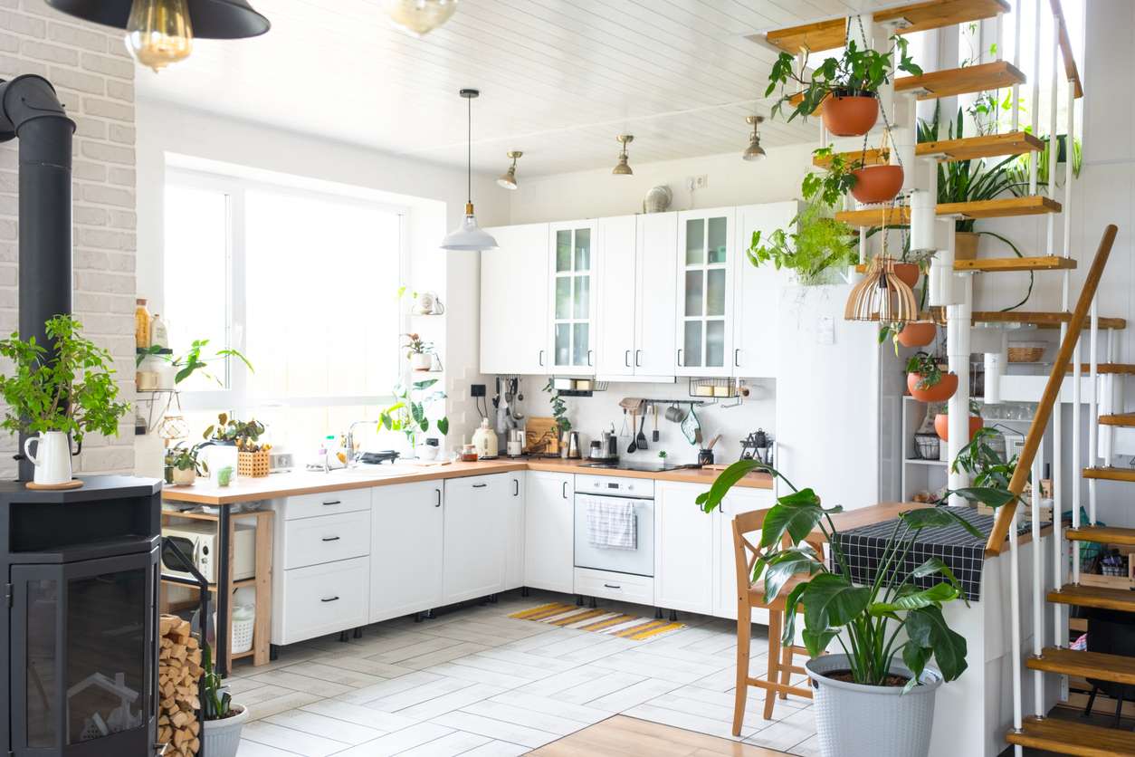

White cabinets looked right for a long time. Then gray took over. Now both feel like the safe choice nobody quite loves anymore — and Boise homeowners planning a kitchen remodel increasingly arrive at consultations knowing they want something different, just not sure what.
That’s a reasonable place to be. Cabinet color is one of the highest-stakes decisions in a kitchen remodel. It covers more visual surface area than any other element, lives with you for ten to fifteen years, and isn’t a quick fix if you get it wrong.
What’s missing from most color advice is local context. Generic design content tells you navy is trending, sage is popular, and wood tones are having a moment. What it doesn’t tell you is how those colors read in Idaho’s particular light, how they relate to Treasure Valley home styles, or what Boise buyers actually respond to at resale. That’s the conversation worth having.
Why Generic Cabinet Color Advice Doesn’t Work for Boise Homes
The color guides you find on national home design platforms are built around photography. A deep forest green cabinet looks stunning in a styled shoot with north-facing skylights in a Pacific Northwest barn conversion. In a south-facing Meridian ranch house in July, that same green reads entirely differently — sometimes great, sometimes overwhelming.
Light is the variable that national content ignores. The Treasure Valley gets over 200 sunny days per year. Most Boise homes deal with abundant direct light in summer, strong glare off west-facing windows in the afternoon, and dramatically different brightness from room to room. A color that reads as calm and earthy in a showroom can read as flat and muddy in a sun-drenched Eagle kitchen with white quartzite countertops.
Architecture is the second variable. Boise’s housing stock ranges from 1920s North End craftsman bungalows to 2010s Meridian new builds to custom foothills homes. The right cabinet color for each of those contexts is not the same. Your home’s architectural style is not a detail to work around — it’s the starting point for the color conversation.
What’s Actually Working in Boise Kitchens Right Now
The industry data points clearly in one direction. According to the NKBA 2025 Kitchen Trends Report, green is the most preferred kitchen cabinet color for the second consecutive year — chosen by 76% of industry professionals — followed by blue at 63% and brown at 56%. White ranked fourth at 50%. The all-white, all-gray kitchen has lost its grip on the market. What’s replacing it isn’t one color; it’s a shift toward warmth, nature connection, and palette choices that feel personal rather than default.
That shift maps directly onto what we see in Boise remodels. Here’s how the major color directions play out in Treasure Valley homes specifically.
Warm Whites and Creams: The Alternative to Stark White
Warm white isn’t a retreat from color — it’s a correction. Stark, blue-undertoned whites read as cold and institutional in Idaho’s strong afternoon light. Warm whites and creams — Benjamin Moore White Dove, Sherwin-Williams Alabaster, and similar shades with yellow or pink undertones — bring brightness without harshness.
In North End craftsman homes, warm white cabinets with natural wood accents honor the architectural warmth of the era. In newer Meridian builds with open floor plans, a creamy white keeps the space feeling bright while grounding it more naturally than bright white ever did. Moreover, warm white is the lowest-risk choice for resale — it reads as clean and updated to essentially every buyer demographic in the Boise market.
Warm Wood Tones: The Direction with Real Staying Power
The NKBA’s year-in-review analysis of 2025 kitchen trends confirmed what we’ve seen in Treasure Valley remodels for the past two years: wood-grain cabinetry overtook painted finishes as the preferred direction, with white oak emerging as the dominant species. Consequently, this isn’t a trend with an expiration date — it’s a return to materials that connect the interior to the natural world, and it fits Idaho’s outdoor-first culture better than almost anything else.
White oak cabinets read as warm, textural, and quietly luxurious in Eagle and Boise Bench homes alike. Walnut is richer and darker, appropriate for homes with higher ceilings and larger square footage. Both work exceptionally well when paired with a painted island in a complementary tone — the two-tone configuration that has become the most requested kitchen layout in Pristine’s Boise projects over the past year.
If you’re committing to a full kitchen remodel and want a color decision that holds up for fifteen years, warm wood is the most defensible choice in the Treasure Valley market right now.
Sage and Muted Greens: Idaho’s Outdoor Connection
Green’s dominance in national trend data isn’t arbitrary. It reflects a desire to connect interior spaces to the natural world — and in Boise, where the foothills are visible from half the kitchens we work in, that connection is literal.
Muted sage greens — soft, grayed-down, not electric — work in Treasure Valley homes in a way that bold greens don’t. They’re calm rather than demanding, and they read as organic rather than trendy. Furthermore, they pair naturally with warm wood tones, quartz countertops, and brushed brass hardware that are increasingly standard in Boise kitchen remodels.
The critical variable with sage green is undertone. Greens with strong blue undertones can read cold in west-facing kitchens with afternoon sun. Greens with yellow undertones — closer to olive — read warmer and more grounded. Test large paint samples in your specific kitchen at different times of day before committing.
Sage green works best in North End craftsman kitchens, foothills homes with landscape views, and Eagle estates where the outdoor orientation of the home informs the interior palette.
Navy and Deep Blue: When It Works and When It Doesn’t
Navy has earned its place in the premium kitchen conversation. Deep, saturated blue — particularly on an island or lower cabinets against lighter uppers — creates the visual weight and sophistication that a serious kitchen remodel should deliver.
In Boise, navy works best in kitchens with the square footage and ceiling height to absorb a dark tone without feeling compressed. Harris Ranch homes with open floor plans, Eagle estates with generous primary kitchens, and Meridian new builds with high ceilings are natural candidates. In a smaller kitchen — common in Boise Bench mid-century properties — navy can make a compact space feel closed in.
The two-tone configuration is the smart entry point: a navy island with warm white or cream perimeter cabinets. This approach gives you depth and visual interest without committing the entire kitchen to a bold color.
Deep Charcoal and Black: For the Right Home Only
Charcoal and black cabinets photograph beautifully and read as sophisticated in the right context. In Boise, that context is narrow: large kitchens with abundant natural light, high ceilings, and countertop materials that provide enough contrast to prevent the room from reading as one dark mass.
In practice, this means custom Eagle homes, larger Harris Ranch builds, and kitchens with significant window exposure on at least two walls. In a smaller or north-facing kitchen, black cabinets are a mistake that’s expensive to correct. Additionally, matte finishes handle dark tones better than gloss in Treasure Valley homes, where strong afternoon light makes gloss fingerprints and watermarks immediately visible.
This is one of the few cabinet color decisions where seeing the color in your actual kitchen — not in a showroom or a photo — is non-negotiable before committing.
Two-Tone Cabinets: Islands vs. Perimeter
Two-tone is less a color choice and more a design strategy — and it’s the approach we recommend most often when a homeowner wants color without full commitment. The standard configuration pairs lighter perimeter cabinets in warm white, cream, or a soft neutral with a deeper or more saturated island in navy, sage, charcoal, or warm wood.
This gives the kitchen visual interest without overwhelming it. It allows for a more expressive color choice in a contained zone. And if the island color ever feels dated, the rest of the kitchen remains a clean, neutral canvas.
Cabinet Color by Home Style and Neighborhood
North End and Craftsman Homes
Craftsman architecture has warm undertones, natural materials, and a design sensibility that rewards earthy, grounded choices. Warm whites, creams, sage green, and warm wood all feel at home here. Moreover, any palette that connects to existing natural materials — exposed wood beams, brick accents, period-appropriate hardware — reinforces the home’s character rather than working against it.
What doesn’t fit: cold grays, stark whites, and high-contrast black-and-white combinations that feel more contemporary than the architecture warrants.
Boise Bench Mid-Century Homes
Mid-century design rewards simplicity, warmth, and restraint. Flat-panel cabinetry in warm white oak, walnut stain, or muted sage aligns naturally with the era’s aesthetic. Two-tone configurations — particularly with a wood-toned lower cabinet and painted upper — honor the mid-century love of material variety without abandoning clean lines.
Bold navy or charcoal can work in Bench homes if the kitchen has been opened up as part of the remodel. In a more original footprint, the scale typically doesn’t support it.
Eagle and Meridian New Builds
Newer construction in Eagle and Meridian generally offers larger kitchens, higher ceilings, and open floor plans that can absorb a wider range of color decisions. As a result, bolder choices have more room to succeed here: full navy or sage perimeter, dramatic two-tone configurations, or natural white oak across an expansive run of cabinetry.
Eagle’s luxury market specifically rewards the investment in custom cabinetry at the right color — it’s part of what makes a high-end kitchen feel like it belongs in the home rather than having been installed in it.
Foothills and Landscape-Oriented Homes
Homes in the Eagle foothills, the Table Rock area, and Southeast Boise often have design sensibilities shaped by the landscape outside. Organic, earthy palettes — warm wood, sage, warm white, soft greige — connect the interior to the terrain in a way that cooler palettes don’t. These homes also tend to have good natural light, which means you have more latitude to use richer tones without the room feeling dark.
What to Think About Before Committing to a Color
Your Countertop Material Sets the Tone
Cabinet color doesn’t exist in isolation — it sits directly below your countertop. The undertones in your countertop material will either harmonize with or fight against your cabinet choice. Warm white quartzite with movement works beautifully with sage or wood-toned cabinets. Stark white quartz with gray veining reads cooler and pairs more naturally with navy or clean white.
This relationship is why we recommend finalizing countertop direction before committing to cabinet color — not the other way around.
Flooring Undertones Matter More Than Most Homeowners Expect
Wood floors carry undertones — yellow, red, orange, or cool gray — and those undertones interact with cabinet color in ways that are immediately visible once everything is installed. Warm-toned wood floors, common in older Boise homes, pair well with warm cabinet palettes and fight cooler ones. Light gray LVP, common in newer builds, gives you more latitude with both warm and cool cabinet choices.
Hardware Finish Ties It Together
Your hardware finish should complete the cabinet color story, not compete with it. Brushed gold and unlacquered brass warm up almost any palette and work especially well with sage, wood tones, and warm white. Matte black is a strong choice with navy and charcoal. Polished nickel is the most versatile finish — it sits comfortably alongside both warm and cool palettes without dominating either.
Whatever you choose, carry it through the plumbing fixtures, lighting, and cabinet pulls throughout the room. Consistency in the hardware family is one of the clearest signals that a kitchen was designed rather than assembled.
Test Colors in Your Actual Kitchen
This is the most important practical step and the most commonly skipped one. Paint large sample cards — at least 12″ x 12″ — and observe them in your kitchen across morning light, afternoon light, and evening artificial light. Colors shift dramatically across these conditions, particularly in Boise’s high-contrast light environment. Consequently, a color that reads perfectly in a showroom may behave very differently in your specific space.
The Resale Question: What Boise Buyers Actually Respond To
Warm white and cream remain the broadest-appeal choices for kitchen cabinets in the Boise resale market. They read as updated, clean, and move-in-ready to the widest range of buyers. Wood tones — particularly white oak — have moved from niche preference to mainstream expectation at the mid-to-upper price tier. A white oak kitchen in a $600K+ Eagle home no longer reads as bold; it reads as current and well-invested.
Sage green and navy are more audience-dependent. The right buyer responds enthusiastically; the wrong buyer mentally budgets a paint job. Therefore, in a home you plan to sell within three to five years, color-forward cabinet choices carry more risk. In a home you’re living in for a decade or more, that calculus shifts — you should love the room you wake up in every morning, and a color that brings genuine satisfaction is worth more than the marginal resale hedge of staying neutral.
Common Cabinet Color Mistakes Boise Homeowners Make
Choosing color from a small paint chip. A 2″ paint chip in a showroom tells you almost nothing about how a color will read across forty linear feet of cabinetry. Always test at scale.
Matching instead of coordinating. Cabinet color doesn’t need to match the countertop — it needs to coordinate with it. Exact color matching creates a flat, single-note room. Coordinated contrast creates depth.
Ignoring adjacent rooms. In an open floor plan — increasingly standard in Boise and Meridian new builds — the kitchen cabinet color is visible from the living area and sometimes the entry. A color that works perfectly in the kitchen in isolation can feel jarring against the living room palette it opens into. Consider the full visual field, not just the kitchen alone.
Choosing trend over fit. The most popular color in national design media is not automatically the right color for your specific home. A color that fits your architecture, your light, and your lifestyle will serve you better than one chosen because it was everywhere on social media in a particular year.
The Cabinet Color Decision Is Part of a Bigger Conversation
Cabinet color is where most homeowners want to start. In our experience, it’s actually where the conversation ends — after layout, countertops, lighting, and hardware direction have all been established. Color is the expression of a design story that’s already been written.
That’s not a reason to postpone thinking about color. Rather, it’s a reason to think about it in context — alongside the other decisions that determine whether a kitchen truly works — rather than in isolation.
If you’re planning a kitchen remodel in Boise and want to work through those decisions together, we’re ready for that conversation. Schedule a free consultation and let’s start with where you actually are — not where the trend reports say you should be.
Pristine Kitchen & Bath | License RCE-58668 | Serving Boise, Eagle, Meridian, Nampa, and the Treasure Valley